The Enduring Enigma of Supertramp’s Breakfast in America Album Cover

Supertramp’s 1979 masterpiece Breakfast in America stands as one of my favorite albums of all time and delivered massive hits like “The Logical Song” and “Take the Long Way Home,” but its unforgettable cover art has sparked fascination and wild speculation for decades. Designed as a playful optical illusion, the sleeve depicts a whimsical airplane window view of New York City. However, this clever artwork later fueled conspiracy theories linking it to the 9/11 attacks. The story blends artistic ingenuity with the strange power of coincidence.
The cover, which earned a Grammy for Best Recording Package in 1980, was conceived by art director Mike Doud with photography by Aaron Rapoport. It shows a smiling waitress named Libby, played by actress Kate Murtagh, posing like the Statue of Liberty. She holds a tray with a glass of orange juice in place of the torch and a menu reading “Breakfast in America” instead of the tablet that Lady Liberty cradles. Behind her, everyday diner items cleverly form the New York skyline. Salt and pepper shakers become skyscrapers, stacks of plates and boxes represent buildings, and the Twin Towers appear as white cardboard containers. A plate of food stands in for The Battery at the southern tip of Manhattan. The entire scene unfolds against a bright blue sky, framed by the curve of an airplane window, creating the illusion of a passenger gazing down at the city.
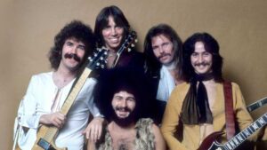
This intricate setup was not shot in New York but staged in a Los Angeles studio. The design team used simple kitchen props painted in uniform off-white tones to mimic an aerial perspective. The concept satirized American culture in a lighthearted way, tying into the album’s title and songs that poked gentle fun at U.S. life. Band members Roger Hodgson and Rick Davies have emphasized that any broader thematic satire was unintentional. The album’s success catapulted Supertramp to new heights, selling millions and topping charts on both sides of the Atlantic.
What truly transformed this cover into a mystery was its unexpected connection to one of the darkest days in modern history. Years after the album’s release, conspiracy theorists noticed eerie parallels to the September 11, 2001, attacks on the World Trade Center. They pointed out that holding the cover to a mirror makes the letters “UP” in “SUPERTRAMP” resemble “9 11” positioned above the Twin Towers. The orange juice glass, held near the towers, was interpreted by some as symbolizing fire or an explosion. Even the album title Breakfast in America drew scrutiny, with claims it hinted at the morning timing of the attacks.

Videos and online discussions amplified these ideas, suggesting the artwork served as “predictive programming” by secret societies like the Freemasons. One theory even tied the band’s finances to Masonic influences. Such claims fit a pattern of rock album covers scrutinized for hidden messages, from backmasking in Led Zeppelin tracks to supposed clues on other classic sleeves.
In reality, the similarities are striking coincidences born from a 1979 design meant to evoke a fun transatlantic flight. The band and designers have consistently dismissed any foreknowledge or intent. The cover’s power lies in its visual trickery and cultural resonance, not prophecy. It captures the optimism and excess of late 1970s America through everyday objects, inviting viewers to look closer and see something more. Perhaps not so closely that one begins to see bizarre prophetic messages that aren’t really there.
Today, the Breakfast in America cover remains a landmark in album art history. It demonstrates how a simple concept, executed with creativity, can endure and inspire endless interpretation. Whether admired for its ingenuity or debated in conspiracy circles, it continues to draw new generations into Supertramp’s world. The mystery endures not because of secret plots, but because great art often reveals more than its creators ever intended.